2010-08-19

Southern Romantic (with a ferrous perspective)


I used to be a determined Landscape photographer. 4x5, chromes, color neg, Polaroid... Not so much these days. At least, I rarely go looking for the ironic vista anymore, although they are increasingly hard to avoid.

In hindsight I find many of my landscape images to be absurdly romantic, like any good love affair.


What I think set them off from more traditional photographic renderings of the Southern landscape was a paradoxical fondness for the deliberate disregard we pay the very land which defines us. Like a bad but lasting marriage, the landscape is littered with relics of past transgressions and episodes, which I enthusiastically dredged up and re-contextualized with a mat and frame, like tales told at a cocktail party. “Remember that 1000 acres they clear-cut for The Scenic Highway near Grayson…? Hooboy!”

2010-02-13

2010: 02: 13 a conundrum for the age


Here's a re-dedication. More writing. Not too much extemporaneous. Not so literal (a conundrum for the age).

Most of my work lately has been on an organized image library (now up to 28,909 images), but I've also realized (perhaps due to that personal retrospective) that I have been neglectful as an artist. The commercial photography that I veered into over a decade ago had seen it's hey day (or is that hay day?) at least a decade before that. Now the metaphor has superceded the representative and I'm back where I started, making pictures of things that aren't in the picture.

I've been rethinking the reasons I chose this path, and arrived here. Making photographs that just look like the things photographed is becoming a poor way to make a living. Photography is different now (how long ago did this actually happen? I've apparently been asleep. Dreaming perhaps) .

The business of photography is different now. I must be different now, without just lying to myself.

Another change is that good technique is now bad, and I don't mean in the parlance of the hip (as in "That's sick, man", which now means "that's good".) I mean that those who can deliberately and repeatably show a consistently bad technique (stylistically consistency) can parlay that willingness and ability to suck into a lucrative career. I don't need to name names, just pick up any counter culture or fashion mag and you'll know what I mean. Wedged into that dreck is some truly inspired work, masquerading as focused indifference to perceptual reality. Work produced by smart people laughing on their way to deposit more cash into short lived (but well stuffed) bank accounts.

In any event, a cycle has come around, and a slow awareness has bloomed. There's a great editorial by Roberta Smith in The NY Times that for some reason, has held my thinking and will need several re-readings to hold dear. But let me recommend it.

http://www.nytimes.com/2010/02/14/arts/design/14curators.html

More later, but sooner. Really... t

2009-11-19

2009 11 06

Ritz Carlton, Les Dames Escoffier "Evening in the City" Fundraiser

2009-10-31

changes

It's been two months...
I don't walk the neighborhood as much as I used to.

2009-07-03

2009-06-14

2006 09 134: another one today, because I can

On June 12, 2009 at about 3:20 in the afternoon
I photographed this ring made by my wife, Judy Parady.
See her work at judyparady.com

Some photographers looking at this might recognize
the background as the reflector from a Lumedyne strobe head.
It's an interesting prop that is somewhat ironic in that the image
was made by window light. The ring is resting on a spool of brown waxed cord.

An understated, or narrow palette has always appealed to me,
and this image shows that tendency.

2009 06 14


March 31, 2009 11:45 am

maybe I'll write something soon. But not today.
Maybe I'll just post images, until I actually have something to say.

2009-03-07

2009 03 06

an image for the spring

2009-03-02

2009:02:26 11:20:43

Lightroom gets me started


I photograph my dog a lot, and since at 13 years old, she is still draggin me around the neighborhood, there's a perspective tendency. More than you needed to know? ahem.

But when using the D700 (back on msg) in duotone mode, I made an exposure that was way hot, but liked it so much I used it as a creative starting point in my conversion through Lightroom. I was talking with my friend Beth Lilly the other day about how the LCD on a digital SLR is a collaborative partner that we didn't have previously. Even though I convert everything from raw files, I still strive for a good in camera WB.

Years ago I worked briefly with Joel Meyerowitz. At the time of every exposure, he made a written list of verbal descriptions that would then serve as a printing guide. Joel was exposing VPL, a tungsten balanced film in all sorts of daylight conditions, so a standard color pack derived from a Kodak test negative (a Shirley) was pretty much worthless. The verbal descriptor was used to torture inform his printers regarding the palette and tone desired from those negs. Big fun. Now we have a jpg. Better fun.

The conversation I had with my friend Beth, was in the context of our immediate creative attraction and response to a scene. That response could either encourage (or not) further exploration within any particular moment or setting. Beth does very interesting work with a cell phone and the feedback from the device is an essential part of the process. If it looks promising, continue to work the scene. If not, move on.

Things look different in a photograph and on the LCD than they do when you perceive them directly, and that syntactical appearance can influence the final rendering of an image, even (or especially) as you are engaged in the process of making the photograph.

This is why, even though I may ultimately create the duotoned image from the full spectrum raw file, I use the camera display to create a sort of collaborative feedback that leads me toward such ultimate decisions as contrast, tonal abbreviation, white balance and saturation. And of course, composition (like the ground glass of a field camera). It also gets me back to that in the moment mindset when I am formulating my interpretation at the desktop.

This "touchstone" concept works in color, too and is why I always strive to hit a WB in camera that I feel compliments the subject/moment and my desired effect or mood, and will enhance the capture processes as well as the post-production creative processes. It melds my visual thinking to my intuitive and visceral responses.

One situation I have found this quite important in, is when a portrait subject can either be enthralled or horrified by the image on the screen. Use with discretion.

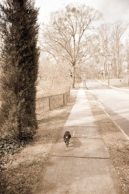
At the top of this post is an image that I created out of my immediate response to that overexposed, warm toned display on my LCD, while walking with Bailey.

I started with the Creative Aged preset in Lightroom, and altered almost everything. The adjustment brush with minus "Exposure" let me bring the sky back in. Some saturation came back, tonal shifts and Clarity and other stuff, too... t

2009-02-24

Lightroom polishing

Java Lords, L5P

Updating the Duotone post:

Here I raised the contrast some with the Tone Curves, using one of my custom Lightroom Presets as a kicking off point. I moved away from red, added some contrast and bumped Fill (a weird combo, counter productive one might think). The adjustment brush lightened her left eye up a little. Clarity ended down in the minus.

Then in Photoshop, converted the 16bit PSD to 8, added a layer to get to the Diffused Glow. Worked it a while and then added a layer mask to bring back some of the darker and lighter areas that had moved too much.

The original image posted last night was not enough for her... t

She makes the best Americano. Really.